19: 19th CENTURY BREAKS WITH TRADITION - UNUSUAL VERSIONS OF THE STANDARD ENGLISH PATTERN
THIS PAGE IS NOW TO BE FOUND AT: http://www.wopc.co.uk/blogs/kenlodge/19th-century-breaks-with-tradition-unusual-version-of-the-standard-english-pattern
Modern designers have often had a go at redesigning the courts on playing cards. This has resulted in an amazing array of non-standard packs, but also in interesting versions of the standard patterns as well. One or two new versions of the standard English pattern have appeared on earlier pages of this blog. But it's not just modern designers who have done this; there are a number of examples from the 19th century, so I thought I'd present a few here.
In England the basic styles of the standard courts changed rather slowly between 1780 and 1830. A number of examples are illustrated on blog page 36. When new printing techniques were introduced from the early 1830s onwards (although the old-style wood-block production continued for several decades alongside the new methods), the courts were redrawn. Some of the redrawings stuck to the traditional format of the figures, whilst others made alterations to the tradition. Whichever route was taken, however, the style was different from what had gone before. So from about 1820 onwards we find redrawings that can be viewed as a modernization process.
An early example is from Stopforth/Hunt, c.1820. It isn't clear who produced these cards first, but the same blocks are found with ASs from either maker.
De La Rue, who invented the letterpress process for printing his cards and received the royal patent in 1831, redrew one set of his first courts so much that they are said to have been rejected by serious card-players. In the illustrated example below all the pips have a white line overlaid on them.
Here the KH is turned, the KD holds an orb and a sceptre, the QC is turned and holds a sceptre and
?necklace, and the QD holds a sceptre and a fan. The clothing has been completely redesigned and looks more realistic.
Other makers followed this trend and produced a number of interesting versions of the pattern. Goodall, for example, redrew his courts with a few alterations to the tradition, e.g. the loss of the KD's hand on the left.
A much more extraordinary pack comes from Creswick, again probably from the 1830s. This looks like an attempt to repersonalize the figures, that traditionally were distorted and stocky, but they look more like their 16th and 17th century predecessors than contemporary courts.
England was not the only place where redrawings occurred. American and Belgian makers had a go at redesigning, too. Humphreys was an early US maker (c.1815-20) who had two different kinds of redrawn court.
Andrew Dougherty in the 1840s used a very non-traditional version of the pattern in his first packs. Under the name of Crehor (without an e) he produced a double-ended version retaining some of the features of his first design, e.g. a profile QD.
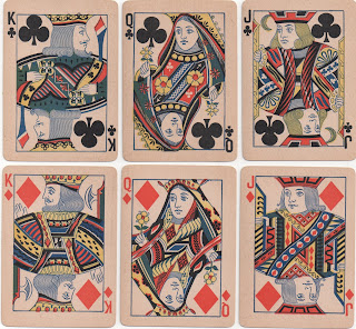
Towards the end of the 19th century a number of makers appeared on the scene who didn't seem to know the tradition of the English court figures in any detail, producing designs that look like English cards but with many of the traditional feature altered. One such maker is Excelsior of Chicago, which seems to have changed to the Chicago Playing Card Co. in c.1890, but retained their court cards. The queens' headdresses are very exotic, the clothing of most of the courts has been altered considerably, and the KH is not holding his weapon aloft, the KD is not in profile, and the KC faces ¾ right not left.
Chicago PCCo, c.1895
There is another version of this design from the same firm, but sometimes called the North American Card Co., in which the clothing has been changed, whilst in most cases the outline plates are the same. However, the KC & KD have had their heads altered and the QS's & QH's headdresses are different at the top by the frame line.
North American Card Co., c.1890
Another example is provided by Pearsall, an otherwise unknown maker from around the same time, who could be Canadian. Their courts are basically those of Dougherty, but with turned postures. However, four cards have what I call "twisted heads", that is head positions which are opposite to that of their bodies. All the spades and the JC have such heads, for no apparent reason.
Pearsall, c.1890 [with thanks to Tom Dawson]
Another pack purporting to be by Jones & Co, London (a non-existent card-maker), but most likely to have been made in the United States, has redesigned figures that look more natural and a coloured AS that is pretending to be an English export ace of the period. The pack is catalogued by Dawson & Dawson (2000) in their edition of Hochman's Encyclopedia, classified as NY31a by Samuel Hart.
These cards are very like those made by Van Genechten of Turnhout, but it's very difficult to say which ones were copied from which. In the Belgian version the figures are assigned to their traditional suits. These cards are from sample books in the Turnhout Playing Card Museum.
These are top-of-the-range quality printed by chromolithography; the ones below are of a cheaper grade.
There are further examples of changes to the traditional postures of the English courts on several of the other pages of the blog.


0 Comments:
Post a Comment
Subscribe to Post Comments [Atom]
<< Home